Decorating Tips & Tricks for a Neutral Design Scheme
Whatever your taste is; using a neutral colour scheme creates a calm, cohesive and professional-looking home without any fuss. Using your favourite furniture, accessories and other decorating elements, whilst keeping to a neutral colour palette, will create an interior scheme that will never go out of style.
A kitchen, lounge, bathroom or bedroom with a neutral design – is an extremely soothing environment to spend time in. You can easily create a neutral look throughout every room of your home by simply mixing different textures and styles for your soft furnishings and accessories from within the same palette. This can be achieved without losing any cohesiveness in the overall effect, as the overall look will be harmonious.
Take a neutral palette from your kitchen diner right through to into every room of your house and get easy show home style in your very own home. Here’s how…
WHAT ARE NEUTRAL COLOURS?
Neutrals for interior design include beige, ivory, taupe, cream, black, grey and shades of white. Using natural materials like wood, wool, cotton, rattan and pottery in your neutral decoration scheme is an easy way to pull in those natural shades too.
Within this family of neutral colours, there are numerous variations of either cool or warm tones, all of which can also be brought in using fabrics, wallpaper, paint, soft furnishings and kitchen finishes too.
TIP: It’s best to try test samples before you totally commit. The shade you love may look totally different next to your other decorative choices in situ.
HOW TO ADD DRAMA TO A NEUTRAL SCHEME
Neutrals can be used for interior design in two ways – either as a soft, neutral only, natural look or as background for dramatic accents.
- If you are going for an all-neutral look, try layering different hues of the same colour. Keep an eye on the individual tones, however, to make sure there is enough contrast.
- If you want drama, try adding strong contrasting elements, such as black or totally different light or dark colour.
- Before you commit to your choices, observe the light in your home at different times of the day. Neutral colours, in particular, can look different at certain times of the day.
- Metallics and mirrors bounce light around your room, furniture can create shadows on the walls, and fabrics can absorb the light. All of this can change the colours of your scheme depending on the light variations.
TIP: Brighter neutrals give your room a more open, fresh and breezy look, whilst muted or darker neutrals give your space a cosier appearance.
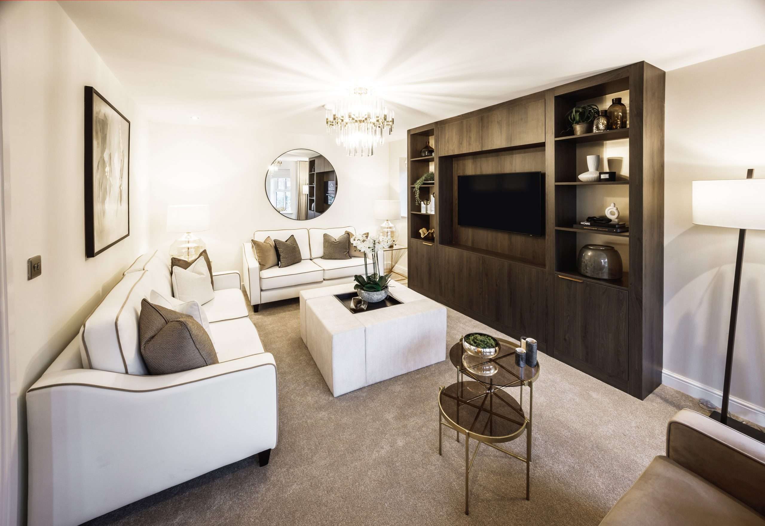
USING BLACK OR DARK BROWN
If you’d like to make more of a statement, but want to keep a neutral scheme throughout your home, try adding some black furniture, ornaments and mirrors. These will act as a strong contrast to your natural scheme, whilst still sticking to a natural palette.
Black can make your scheme pop and is super cool in any interior space. If you want a slightly softer contrast, try a dark brown instead. Here are a few examples of darker accessories you could implement into your interior:
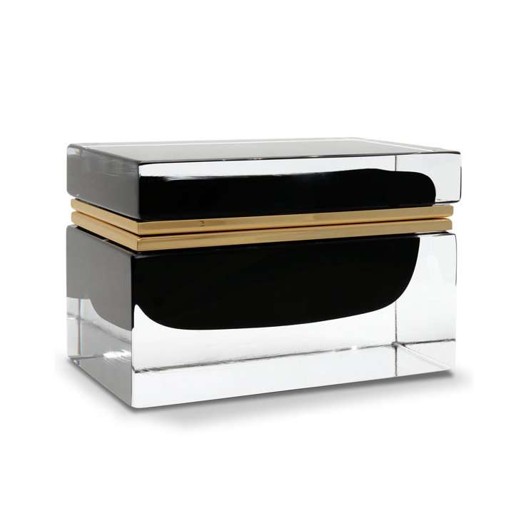
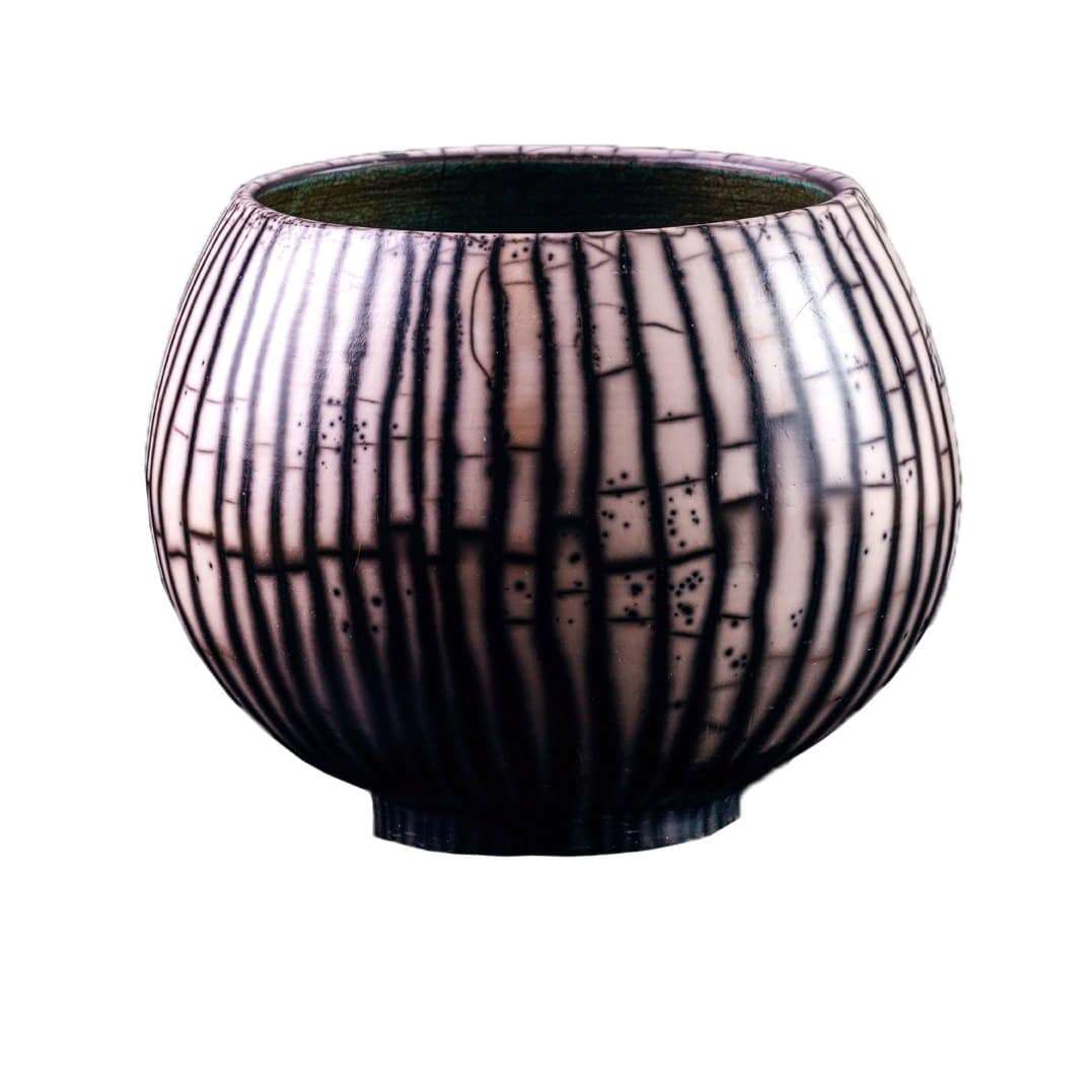
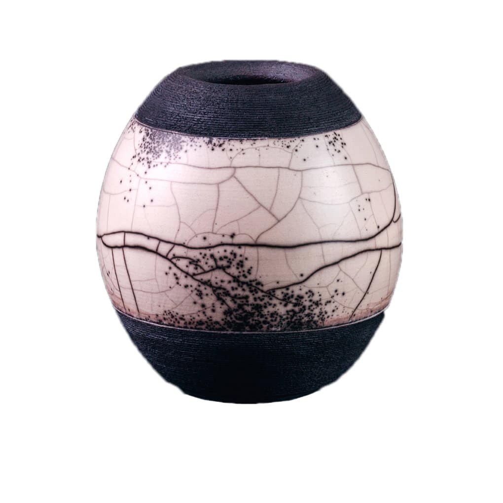

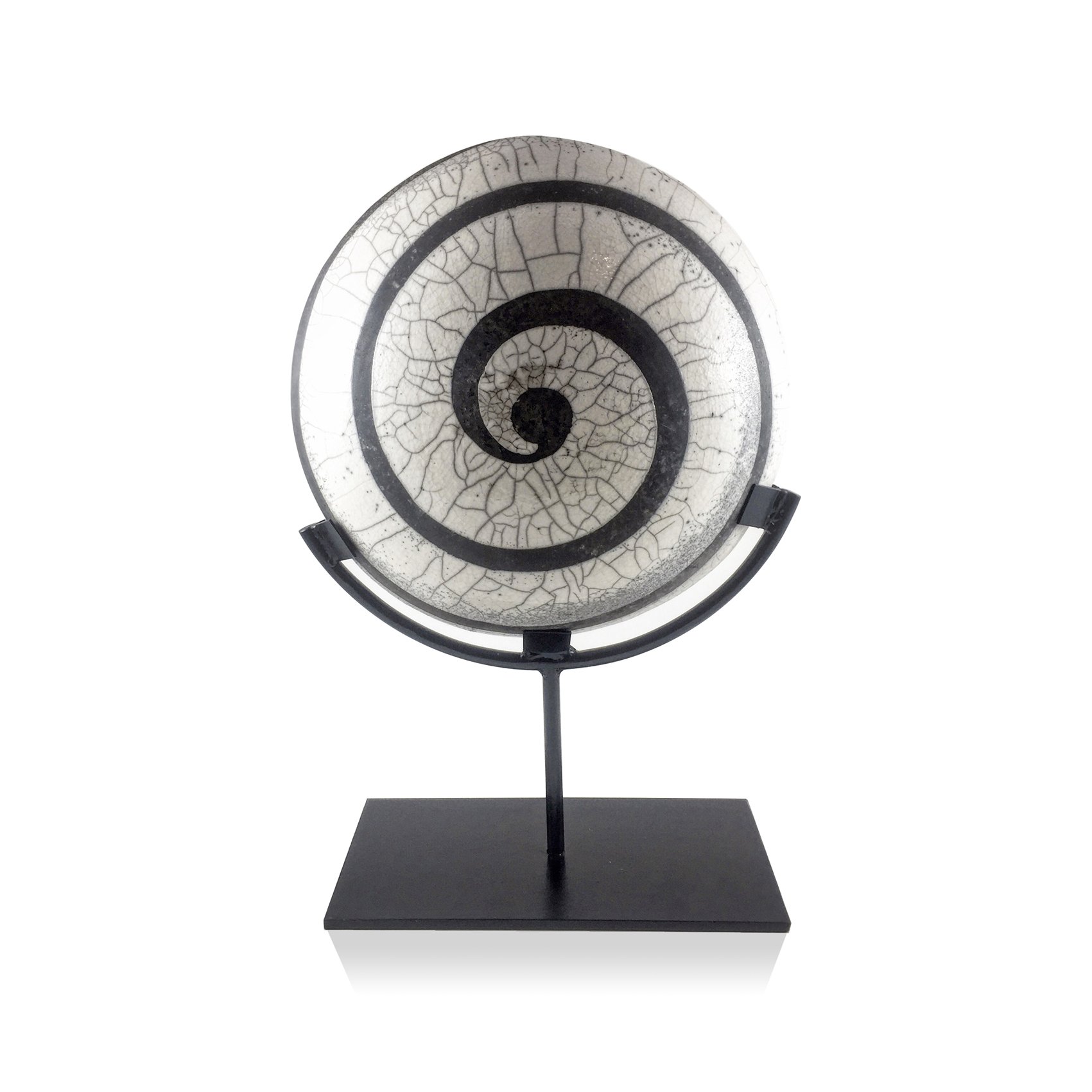
TIP: Experiment with darker accents in your furniture choices, such as installing a wall-mounted media unit, contrasting kitchen cabinets or an arcus, black-framed mirrors or a painted metal coffee table, for an ultra-modern look.
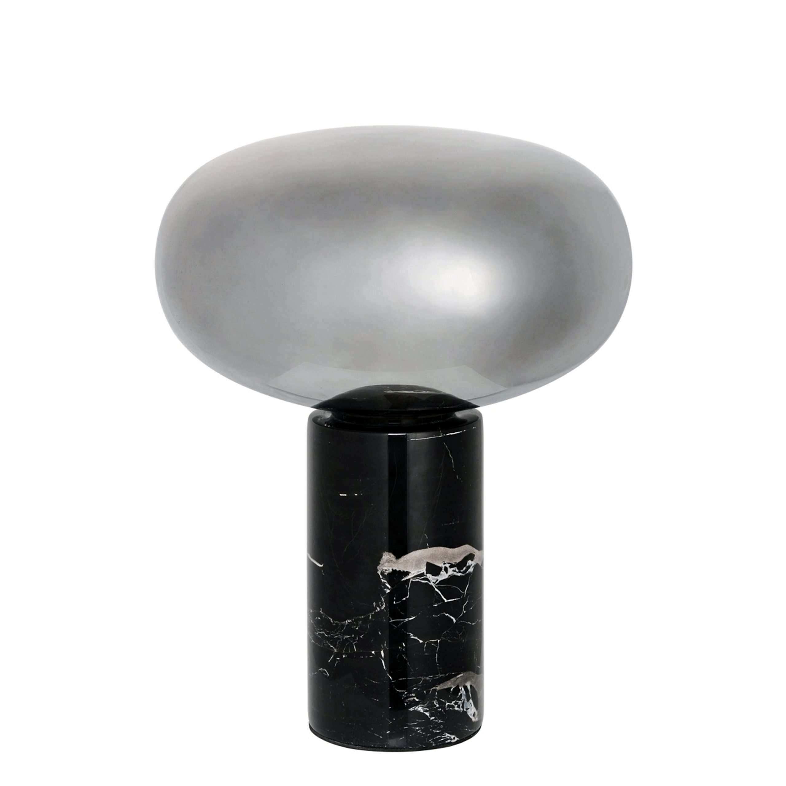
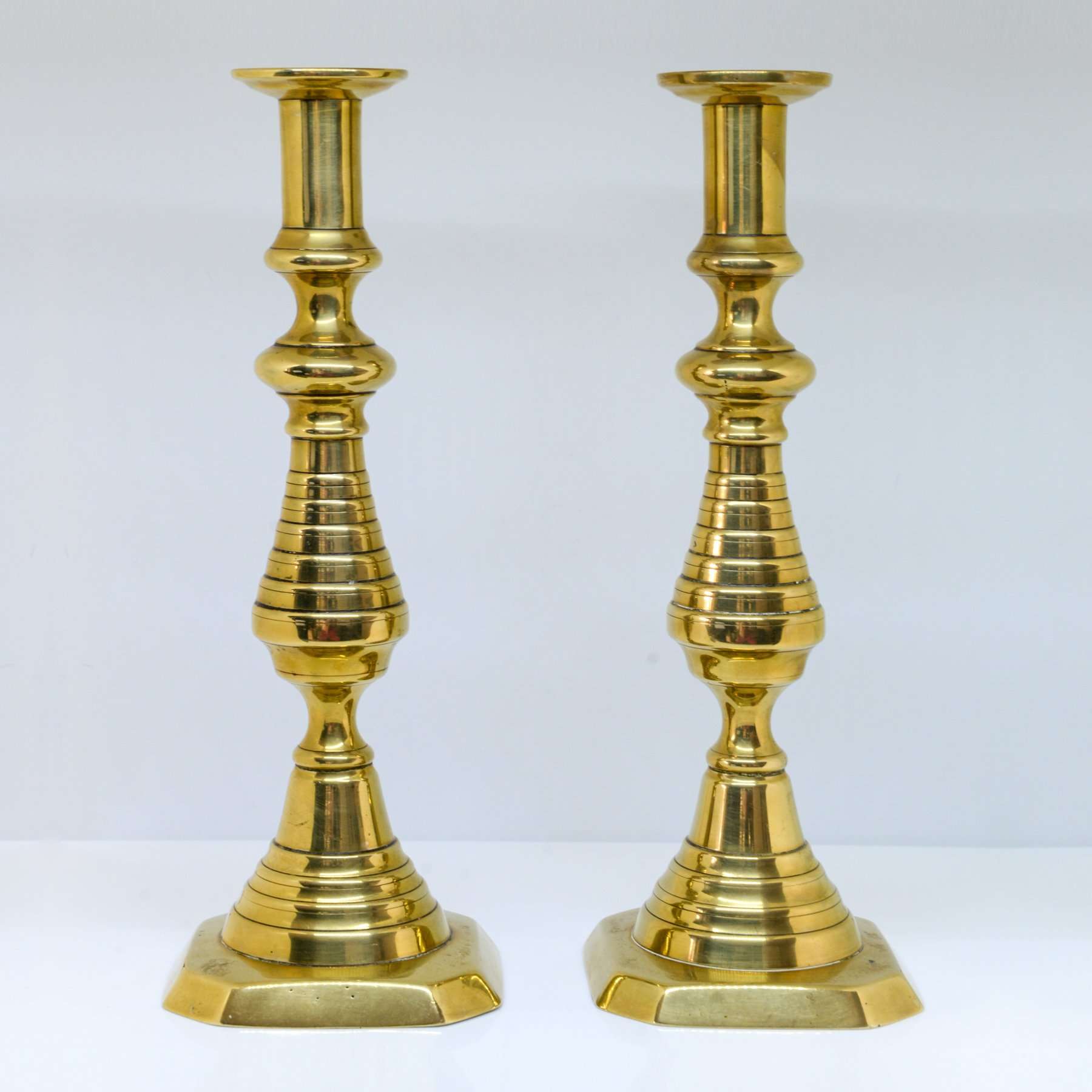
ADDING LUXURY WITH METALLICS
Another way to add drama to a neutral scheme is to sprinkle metallic accessories such as art, mirrors, candle holders, cutlery, ornaments & other decorative pieces throughout your entire home. This design trick adds reflective surfaces and a subtle shine, as well as a touch of sophistication and decadence to your look.
There are a lot of pieces from Micucci Interiors collection with gold, brass or copper accents, which will add warmth to your neutral tones. For a cooler look, add silver-coloured accessories to your scheme. Here are a few ideas:


EXPERIMENT WITH COLOUR
Neutral elements always stay in vogue, but you may want to add a pop of your favourite colour into the mix.
- Keep the neutral theme as your canvas and add another stronger colour as a contrast, such as lilac, blue or mint – all in the top 10 paint trends for this year. When you fancy a change, it’s cheaper and easier just to swap out your coloured accessories and repaint or re-paper a feature wall with another colour to change your look, without having to totally redecorate the whole space.
- Different finishes of paint such as gloss, satin, eggshell or matt reflect light in different ways, so you can get different effects and textures within a close neutral palette by using them together.
- Neutral walls can really make artwork or other statement pieces such as mirrors, pop.
TIP: Plants, fake or real, add to the overall natural effect, whilst bringing a different colour into the mix and are another way to create bright focal points.
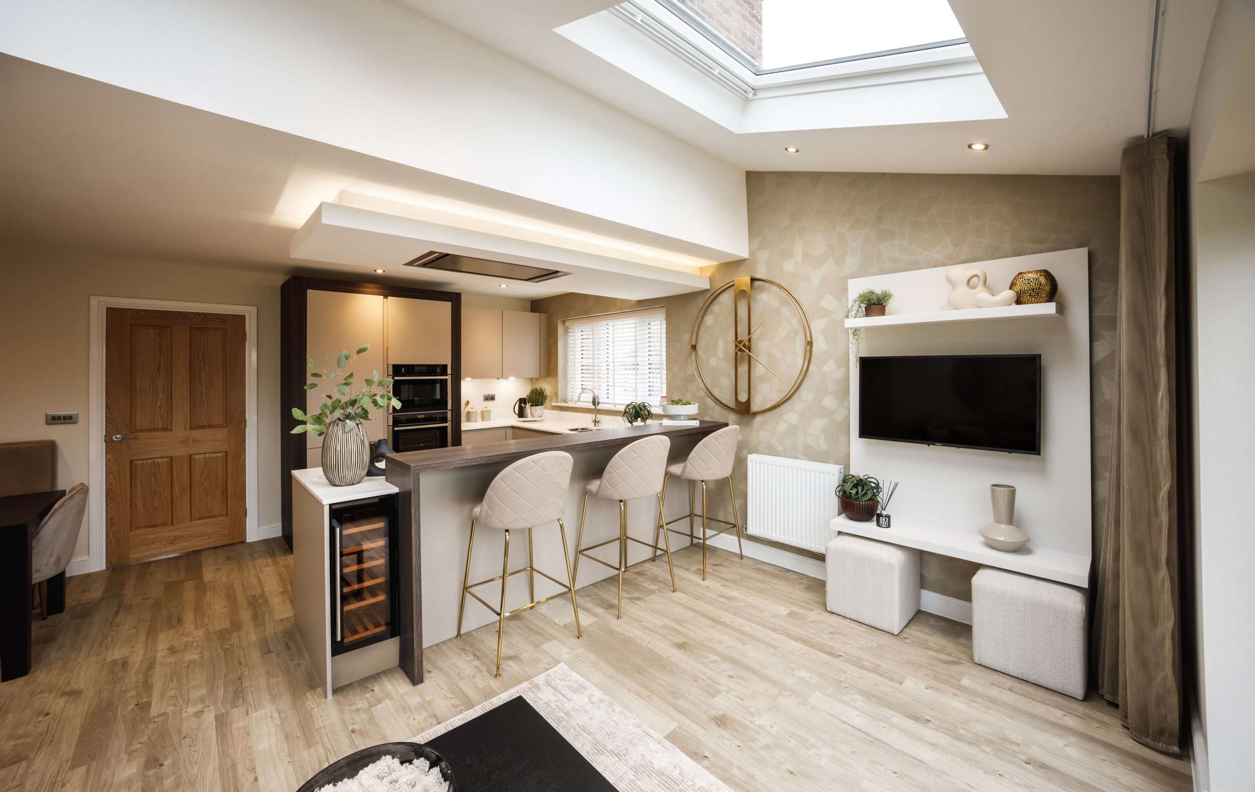
Neutral interior design – The Whittingham Show Home in Longridge
Create’s Brand Director and Founder Gill Mathison, chose the Mocha Create Homes Colour Collection for the show home kitchen at The Sandpipers.
The colours and textures of that neutral scheme flow seamlessly through into the interior design of the whole show home.
The addition of light upgraded worktops with a cool veined marble look, add an extra touch of luxury to the nature-inspired design.
Showhome kitchen specifications:
– Colour Collection: Mocha
– Units: Agate Grey
– Arcus: Terra Larix
– Breakfast bar: Natural Sangha
– Worktop upgrade: Platinum upgrade Oro (veined worktop)
– Peninsular upgrade: Seamless quartz downturn
Becky Haslam
Marketing Manager, Create Homes